引言
参见
https://mp.weixin.qq.com/s/U8oI7n1xch89QvERdQMjUA
内容一
一、CSS是什么, 它从哪来?
想象一下, HTML就像是一个人的骨架, 它决定了网页的结构——哪里是头, 哪里是身体, 哪里放按钮. 但光有骨架可不行, 看起来太吓人了! 这时候就需要CSS来当”化妆师”, 给网页穿上漂亮的衣服.
CSS全称是Cascading Style Sheets(层叠样式表), 简单说就是一套给网页”化妆”的规则. 比如:
<!--这是HTML -->
<p>我是普通文字</p>
<p class="fancy">我是fancy文字</p>

<!--这是CSS -->
<style>
  .fancy {
    color: pink;
    font-size: 20px;
    text-shadow: 2px 2px 4px #000;
  }
</style>
二、CSS的核心概念
2.1 选择器
选择器就像化妆时的”定位工具”, 告诉浏览器你要给谁化妆. 常见的有:
1)标签选择器:
p { color: blue; } /*所有<p>变蓝色*/
2)类选择器:
.warning { color: red; } /*class="warning"的元素变红色*/
3)ID选择器:
#header { height: 60px; } /*id="header"的元素高度60px*/
4)后代选择器:
nav a { text-decoration: none; } /*nav里的所有<a>去掉下划线*/
5)伪类选择器:
a:hover { color: orange; } /*鼠标悬停时<a>变橙色*/
2.2 盒模型
在CSS眼里, 每个元素都是一个盒子, 由内到外分别是:
内容(content) → 内边距(padding) → 边框(border) → 外边距(margin)
用代码表示:
.box {
  width: 200px;         /*内容宽度 */
  padding: 20px;        /*内边距 */
  border: 5px solid;    /*边框 */
  margin: 10px;         /*外边距 */

  /*实际占用宽度 = width + padding*2 + border*2 + margin*2
                 = 200 + 40 + 10 + 20 = 270px */
}
用box-sizing: border-box可以让width包含padding和border, 计算更直观:
.box {
  box-sizing: border-box;
  width: 200px;  /*现在200px包含content+padding+border */
  padding: 20px;
  border: 5px solid;
  /*实际内容宽度 = 200 - 40 - 10 = 150px */
}
2.3 层叠与继承
当多个样式规则作用于同一个元素时, 浏览器会根据以下规则决定用哪个:
1、来源优先级(从高到低)
用户标记为!important的样式.

开发者标记为!important的样式.

开发者写的普通样式.

用户设置的普通样式.

浏览器默认样式.
2、选择器权重:
行内样式(style属性) : 1000.

ID选择器: 100.

类/伪类/属性选择器: 10.

标签/伪元素选择器: 1.

通配符(*): 0.
3、书写顺序: 后写的覆盖先写的
/*权重计算示例 */
#nav .item { color: red; }   /*100 + 10 = 110 */
div#nav .item { color: blue; } /*1 + 100 + 10 = 111 (胜出) */
继承则是指某些样式会从父元素传递给子元素, 比如font-family、color等.但不是所有属性都能继承, 比如border、margin就不会.
三、现在CSS核心特性
1)Flexbox弹性布局:
.container {
  display: flex;
  justify-content: center; /*水平居中 */
  align-items: center;    /*垂直居中 */
  gap: 10px;              /*子项间距 */
}

.item {
  flex: 1;  /*自动伸缩 */
}
2)Grid网格布局:
.container {
  display: grid;
  grid-template-columns: 1fr 2fr 1fr; /*三列,中间列是两倍宽 */
  grid-template-rows: 100px auto;
  gap: 15px;
}

.header {
  grid-column: 1 / 4; /*跨3列 */
}
3)CSS变量:
:root {
  --main-color: #4CAF50;
  --padding: 15px;
}

.button {
  background: var(--main-color);
  padding: var(--padding);
}
4)动画:
@keyframes bounce {
  0%, 100% { transform: translateY(0); }
  50% { transform: translateY(-20px); }
}

.ball {
  animation: bounce 1s infinite;
}
四、浏览器如何渲染CSS
4.1 关键渲染路径
当浏览器加载网页时, 会经历以下步骤:
解析HTML -> 构建DOM树.

解析CSS ->构建CSSOM树.

合并DOM和CSSOM -> 形成渲染树(Render Tree).

计算布局(重排/回流) -> 确定每个节点的位置和大小.

绘制(重绘)->把元素画到屏幕上.
4.2 重排(reflow)与重绘(repaint)
重排: 当元素几何属性改变(宽度、位置等), 浏览器需要重新计算布局

重绘: 当元素外观改变但不影响布局(颜色、阴影等), 只需重新绘制
4.3 浏览器引擎差异
不同浏览器使用不同的渲染引擎:
Chrome/Safari/Edge: Blink(Chrome)、WebKit(Safari)

Firefox: Gecko

IE: Trident
这导致了著名的”浏览器兼容性”问题. 解决方法:
/*原始代码 */
.box {
  display: flex;
}

/*处理后 */
.box {
  display: -webkit-box;
  display: -ms-flexbox;
  display: flex;
}
css伪类
参见 https://mp.weixin.qq.com/s/LfToLMspsd77TD1pT77otQ
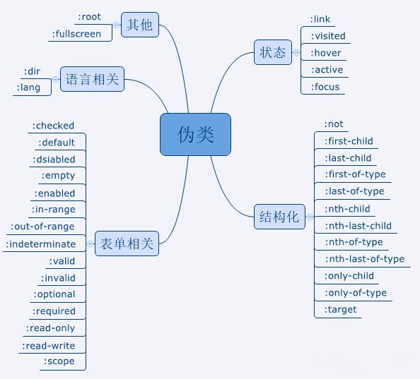
伪类包括:
语言相关伪类,表单相关伪类,结构化伪类,状态伪类,其它伪类。如图所示:
状态伪类
状态伪类是根据用户行为而动态变化的。因此该元素会根据其状态呈现不同的样式。当元素处于某状态时会呈现该样式,而进入另一状态后,该样式就会失去。状态伪类的顺序很重要,顺序错误可能会导致没有效果。通常的建议是LVFHA,即 —– link,visited,focus,hover,active。
:link 链接没有被访问前的样式效果
:visited 链接被访问后的样式效果
:hover 鼠标悬停在元素上面时的样式效果
:active 点击元素时的样式效果,即按下鼠标左键时发生的样式
:focus 用于元素成为焦点时的样式效果,常用与表单元素
代码示例:
<template>
    <div class="home">
        <a href="www.baidu.com" target="_blank">去哪玩</a>
        <input value="云南" />
    </div>
</template>
<!-- css部分 -->
<style>
a:link {    color: #333;  }
a:visited {    color: #ddd;  }
a:hover {    color: red;  }
a:active {    color: green;  }
input:focus {    color: orange;  }
</style>
这个需要自己亲身体验一下,在悬浮,按下(先按一会儿再抬起),然后再返回此页时,看链接的变化…
结构化伪类
结构化伪类是利用 DOM 树进行元素过滤,通过文档结构的互相关系来匹配元素,能够减少 class 和 id 属性的定义,使文档结构更简洁。值得注意的是,伪类中的参数n是从0开始,而我们所说的第几个元素是从1开始数的,而不是从0开始数。
:first-child: 选择符合的元素,该元素必须是其父元素的第一个子元素
:last-child: 选择符合的元素,该元素必须是其父元素的最后一个子元素
:nth-child(n): 选择符合的元素,该元素必须是其父元素的第n个子元素
代码示例:
<template>
    <div class="home">
        <div class="active">第一项</div>
        <div class="active">第二项</div>
        <div class="active">第三项</div>
    </div>
</template>
<!-- css部分 -->
<style>
/* 结构伪类 */
.active:first-child {
    font-size: 16px;
    color: red;
    font-weight: bold;
}
.active:last-child {
    font-size: 16px;
    color: green;
    font-weight: bold;
}
/* 代码中的n表示一个从0开始的自然数,他会逐渐+1
所以第二个元素以后的所有项都变成蓝色   */
.active:nth-child(n + 2) {
    font-size: 28px;
    color: blue;
}
</style>
:first-of-type: 选择符合的元素,该元素必须是其父元素的第一个子元素
:last-of-type: 选择符合的元素,该元素必须是其父元素的最后一个子元素
:first-of-type 和 :last-of-type 。:first-of-type 和 :nth-of-type(1) 是一个意思。:last-of-type 和 :nth-last-of-type(1) 是一个意思
<template>
    <div class="home">
        <div class="active">第一项</div>
        <div>鹤立鸡群</div>
        <div class="active">第二项</div>
        <div class="active">第三项</div>
        <div class="active">第四项</div>
        <div class="active">第五项</div>
    </div>
</template>
<style>
.active:first-of-type {
  color: red;
  font-weight: bold;
}
.active:last-of-type {
  color: green;font-weight: bold;
}
</style>
:not(selector): 选择所有该元素以外的元素。:not后面跟的可以是任何选择器。
<template>
    <div class="home">
        <div>
            <div class="active">第一项</div>
            <li>混混</li>
        </div>
        <div>
            <div class="active">第一项-01</div>
            <div class="active">第一项-02</div>
        </div>
        <div>鹤立鸡群</div>
        <div>
            <div class="active">第二项</div>
            <div class="active">第三项</div>
            <div class="active">第四项</div>
            <div class="active">第五项</div>
        </div>
    </div>
</template>
<style>
.active:not(:first-child) {
    color: red;
    font-size: 28px;
    font-weight: bold;
}
</style>
:nth-last-child(n): 选择符合的元素,该元素必须是其父元素的倒数第n个子元素
:nth-last-of-type(n): 选择符合的元素,该元素必须是其父元素的倒数第n个子元素
:nth-of-type(n): 选择符合的元素,该元素必须是其父元素的第n个子元素
下面说下:nth-of-type(),:nth-child() 的区别,这两个很容易搞混。
nth-of-type他是当前元素的同类型兄弟元素的第n个,而nth-child是当前元素的兄弟节点的第n个当前元素
示例说明:
<template>
    <div class="home">
        <div class="active">第一项</div>
        <a>      鹤立鸡群    </a>
        <div class="active">第二项</div>
        <div class="active">第三项</div>
        <div class="active">第四项</div>
        <div class="active">第五项</div>
    </div>
</template>
<style>
.active:nth-of-type(4) {
    color: red;
    font-weight: bold;
}
.active:nth-child(4) {
    color: green;
    font-weight: bold;
}
</style>
但是,如果我们把换成<div>,则效果如图:
.active:nth-of-type(4)定义的红色被覆盖。说明这个标签,也就是类型如果是相同的,那么,:nth-of-type(),:nth-child() 用法一致;如果不相同,则所指就不一样了。
:only-of-type: 选择符合的元素,该元素的父元素可以有多个子元素,但是类型为此类型的子元素只有一个。
<template>
    <div class="home">
        <div>
            <div class="active">第一项</div>
            <li>混混</li>
        </div>
        <div>
            <div class="active">第一项-01</div>
            <div class="active">第一项-02</div>
        </div>
        <div>鹤立鸡群</div>
        <div>
            <div class="active">第二项</div>
            <div class="active">第三项</div>
            <div class="active">第四项</div>
            <div class="active">第五项</div>
        </div>
    </div>
</template>
<style>
.active:only-of-type {
    color: red;
    font-size: 28px;
    font-weight: bold;
}
</style>
你品,你仔细品~~~要相同标签(相同类型)的….
:only-child: 选择符合的元素,该元素的父元素只有一个子元素,就是该元素。
<template>
    <div class="home">
        <div>
            <div class="active">第一项</div>
        </div>
        <div>鹤立鸡群</div>
        <div>
            <div class="active">第二项</div>
            <div class="active">第三项</div>
            <div class="active">第四项</div>
            <div class="active">第五项</div>
        </div>
    </div>
</template>
<style>
.active:only-child {
    color: red;
    font-size: 28px;
    font-weight: bold;
}
</style>
:target: 选择当前活动元素(点击URL包含锚的名字) 。 跟锚点有关。即设置当前锚点的样式。
<template>
    <div class="home">
        <a href="#id1">第一项</a>
        <a href="#id2">第二项</a>
        <div id="id1">第一项内容</div>
        <div id="id2">第二项内容</div>
    </div>
</template>
<style>
:target {
    color: red;
    font-size: 28px;
    font-weight: bold;
}
</style>
语言相关伪类
:lang(language):
匹配设置了特定语言的元素 设置特定语言可以是:HTML元素设置lang=” “属性,meta元素设置charset=” “属性,或者是在 http头部上设置语言属性。实际上,lang=” “ 属性不只可以在 html 标签上设置,也可以在其他的元素上设置。
:dir():
匹配指定阅读方向的元素。当 HTML 元素中设置了 dir 属性时该伪类才能生效。现时支持的阅读方向有两种:ltr(从左往右)和 rtl(从右往左)。目前,只有火狐浏览器支持 :dir 伪类,并在火狐浏览器中使用时需要添加前缀( -moz-dir() )(试验阶段)。
表单相关伪类
:disabled: 选择所有禁用的表单元素
:enabled: 选择没有设置disabled属性的表单元素
:in-range: 选择在指定区域内的表单元素
:out-of-range: 选择不在指定区域内的表单元素
:valid: 选择条件验证正确的表单元素
:invalid: 选择条件验证错误的表单元素
:required: 选择设置required属性的表单元素
:optional: 选择没有required属性,即设置 optional属性的表单元素
:read-only: 选择设置只读属性的表单元素
:read-write: 选择处于编辑状态的元素;input,textarea 和设置 contenteditable 的 HTML 元素获取焦点时即处于编辑状态
:checked: 匹配勾选的input元素,input元素包括 radio 和 checkbox
:empty: 匹配所有没有子元素的元素
<template>
    <div class="home">
        <div class="active"></div>
        <div class="active">有没有</div>
    </div>
</template>
<style>
.active:empty {background: seagreen;  }
.active {
    width: 100px;
    height: 100px;
    border-radius: 50%;
    margin-bottom: 10px;
}
</style>
:default: 匹配默认选中的元素(提交按钮总是表单的默认按钮)
:indeterminate: 当某组中的单选框或复选框还没有选取状态时,:indeterminate 匹配该组中所有的单选框或复选框。
:scope: 匹配处于 style 作用域下的元素。当 style 没有设置 scope 属性时,style 内的样式会对整个 html 起作用。(试验阶段)
示例代码:
<template>
    <div class="home">
    <form>
        <label for="username">用户名:</label>
        <input type="text"id="username"name="username"placeholder="请输入用户名"required />
        <br /><br />
        <label for="password">电话:</label>
        <input type="text"id="phone"name="phone"placeholder="请输入密码"required />
        <br /><br />
        <label for="password">密码:</label>
        <input disabledtype="password"id="password"name="password"placeholder="请输入密码"required />
        <br /><br />
        <label for="remember">记住我:</label>
        <input type="checkbox"id="remember"name="remember" />
        <br /><br />
        <label for="subscribe">订阅新闻简报:</label>
        <input type="checkbox"id="subscribe"name="subscribe"checked />
        <br /><br />
        <input type="submit"value="提交" />
    </form>
    </div>
</template>
<style>
    /* 用于选择已启用的输入框 */
    input:enabled {border: 2px solid #008000;  }
    /* 用于选择已禁用的输入框 */
    input:disabled {background-color: #f9c8c8;  }
    /* 用于选择已被选中的复选框 */
    input[type='checkbox']:checked {transform: scale(2.2);
    /* check选中以后,放大复选框 */  }
    /* 用于选择具有不确定状态的复选框,不透明度设置成 0.2 */
    input[type='checkbox']:indeterminate {opacity: 0.2;  }
</style>
其它伪类
:root:
匹配文档的根元素。一般的 html 文件的根元素是 html 元素。
使用:root来定义一个全局的字体大小:
:root {
--font-size: 16px;
// 定义CSS变量;
box-sizing: border-box;
// 代码中所有盒模型的边框向内挤压}
在其他的CSS规则中,你就可以引用这个字体大小变量:
body {font-size: var(--font-size);}
:fullscreen:
匹配处于全屏模式下的元素。全屏模式不是通过按 F11 来打开的全屏模式,而是通过 Javascript 的 Fullscreen API 来打开的,不同的浏览器有不同的 Fullscreen API,而且不能是onload时全屏,而是需要事件触发。目前,:fullscreen 需要添加前缀才能使用。
示例只是一个简单代码,如果用于开发,还需要兼容,需完善一下。
<style>
html,body{
    position: relative;
    display: grid;
    align-items: center;
    justify-content: center;
    width: 100%;
    height: 100%;
    margin: 0;
}
.main{
    width: 50vw;
    padding: 2em;
    text-align: center;
    background-color: aquamarine;
    transition: background-color 100ms ease;
}
.main:fullscreen{
    background-color: DarkRed;
    color: white;
}
.box2{
    width: 50vw;
    height: 500px;
    background-color: pink;
    position: fixed;
    top: 0;left: 0;
    z-index: 1;
}
</style>

<section class="main">
    <h1>元素在全屏显示模式下的CSS样式</h1>
    <p>css伪类:fullscreen应用于当前处于全屏显示模式的元素。</p>
    <button id="toggle-pattern">全屏模式</button>
</section>
<div class="box2">box2</div>

<script>
    const targetElement = document.querySelector('.main');
    const togglePatternButton = document.querySelector('#toggle-pattern');
    togglePatternButton.addEventListener('click', _ => {
        if (!document.fullscreenElement) {
            targetElement.requestFullscreen();
            togglePatternButton.textContent = '退出全屏';
        } else {document.exitFullscreen();
            togglePatternButton.textContent = '全屏模式';
        }
    });
</script>
高级用法
假设我们需要创建一个产品列表,其中每个产品项都包含一个标题和一段描述,当鼠标悬停在产品项上时,产品项的背景颜色会发生变化,并且标题会变绿。即实现一个动画效果。
<div class="product-list">
    <div class="product">
        <h2 class="title">产品名称</h2>
        <p class="description">产品描述...</p>
    </div>
</div>

<style>
.product-list {
  display: flex;
  flex-wrap: wrap;
  gap: 20px;
}

.product {
  width: calc(33.33% - 20px);
  padding: 20px;
  background-color: #f1f1f1;
  transition: background-color 0.3s;
}

.product:hover {
  background-color: #ddd;
}

.title {
  font-size: 1.2em;
  transition: color 0.3s;
}

.product:hover .title {
  font-weight: bold;
  color: green;
}
</style>
纯 CSS 图标集cssicon
这个包最后一次更新是Dec 6, 2020,有些旧了。
参见 https://mp.weixin.qq.com/s/keksQnzXjDDm_lGH0lEwUw
安装方式:
你可以直接从 GitHub 页面下载代码,或者通过 npm 安装(如果你在前端项目中使用 npm)。
npm install cssicon
你也可以直接将其包含在 HTML 文件中,通过 引入 CSS 文件。
<link rel="stylesheet"href="https://cdn.jsdelivr.net/npm/cssicon@latest/cssicon.min.css" />
jsdelivr搜索 https://www.jsdelivr.com/?query=cssicon